The type of typeface we will choose is usually one of the last things on our minds when producing printed marketing materials.
The actual design and content are typically the first things we take into account before choosing colors and graphics.
You might eventually get around to thinking about the type of font to use once all of this is set up.
The choice of typeface might not always come to mind while creating a new print design. Your design’s general concept and other crucial elements like color, imagery, and graphics frequently come first. However, legibility should be one of your top priorities when designing for print, and this necessitates giving typeface selection top priority.
Why is the typeface so crucial?
It is, is a straightforward response to this! Your message will be immediately lost if your clients find it difficult to read the leaflet, pamphlet, brochure, billboard, or poster that you want them to read.
Your writing must be readable and clear, but it must also be consistent with your brand’s overall identity.
Designers should consider the following two factors while choosing a typeface:
- Legibility: Clarity is measured by legibility. How distinct are different letters from one another?
- Readability: The term “readability” describes how a typeface’s letters and characters work together to form words, phrases, and paragraphs.
Your choice of font should be readable and clear, and it should also be consistent with your brand identity of you (or your customer). The wrong decision can quickly undercut your design’s tone and message, and if your design is difficult to understand, your message won’t be understood.
We’ve put together the best and worst fonts for printing so you can have a better sense of what kind of fonts look good in print. We like to believe that we have a decent understanding of what works well and what flat-out doesn’t work considering the variety of fonts that pass through our printers on a daily basis. If you’re on the search for printing in Glendale, look no further, BJ’s Printing Emporium does it all!
Sans Serif or Serif?
According to certain theories, designs intended for print should only use serif fonts, whereas those intended for computer viewing should only use sans serif fonts.
Long passages of text become more readable and may be read more quickly because of serifs, which are historically associated with facilitating eye movement across lines of text. However, this does not imply that sans serif fonts cannot be used for print; many of them are just as readable and may even better support your brand identity. A sans serif typeface’s streamlined letterforms can sometimes make it simpler to read the text in smaller sizes.
Here is a general rule for when we advise using a serif typeface instead of a sans serif typeface:
Serif: Text-heavy publications like books, newspapers, magazines, etc.
Brochures, annual reports, captions, headings, graphs, and shorter text blocks can all be written in sans serif.
Why Is a Typeface Legible?
Consider these qualities while choosing a typeface for readability:
● Characters with similar widths: It will be more difficult for the eye to read your text in accordance with its natural rhythm if the width of the characters in your chosen typeface varies too significantly.
● Medium height-to-width ratio: When letters are compressed (as in, have a bigger height-to-width ratio), the characteristics that make up legibility (such as stems, bars, and loops) also get compressed, making it harder to distinguish between them.
● Medium x-height: The type will appear denser and more challenging the larger the x-height.
● standardized stroke weight Extreme variations in stroke weight, particularly for serif fonts, can make text difficult to read.
● Large counters will cause the reader’s eye to move more slowly.
● Uncertain of the meaning of some of these terms? Learn the structure of a letter.
The Best and Worst Print Typefaces
Decide on a typeface now. The best choices will be shown first, in no particular order:
Times New Roman

This typeface is frequently used for body text because it was initially created for the British newspaper “The Times” (thus the name “Times New Roman”). Times New Roman is extremely readable and a reliable option no matter the situation, despite the opinion of some designers that it has been overused.
Try using Baskerville if you want a similar serif style; choose Arial if you want a sans serif version of Times New Roman.
Garamond

The history of this classy yet simple to read serif typeface is extensive. The Garamond you see in most word processors today wasn’t actually cut by a French typographer named Garamont in the 16th century; rather, it was carved by another designer named Jean Jannon. (The Adobe Garamond is a genuine Garamond if you’re creating in Adobe.) How did Garamond come to be associated with Jannon’s typeface? After being “lost” for approximately 200 years—that is, entirely ignored—it was “found” in 1825 and credited to Garamont.
The modern version of Garamond offers a wide range of options, making it a timeless and adaptable typeface for your print design. It works nicely for both body material and headlines.
In our series on the development of typography, find out more about the history of Garamond.
Helvetica

Graphic designers have been obsessed with Helvetica ever since its debut in 1957. This sans serif typeface has a prestigious place in the hearts of designers all around the world thanks to its adaptability. It is one of the most frequently used fonts, especially for detailed information and body content, because it is clear and simple to read and is also quite adaptable.
Three of the worst fonts to choose when printing
Comic Sans
Once popular, this font is now categorically forbidden. It is a font that almost all designers will tend to avoid, despite the fact that it tends to appeal more to a younger market and is quite popular when addressing children. On paper, it can occasionally be

difficult to read if certain colors are utilized; yellow is especially difficult to read. Since it was made to resemble comic book fonts, this is where it belongs, in my opinion.
Segoe Script

The biggest issue with Segoe Script is that it’s difficult to read and difficult to pair with other typefaces. Sentences frequently read like one long line of text, which makes it easy for the reader to get disoriented when reading the information they are looking for. Segoe Script should be avoided even though handwritten typefaces can give the text a sophisticated, rustic sense.
Impact
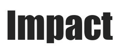
The Impact typeface is third on our list but certainly not the least. Impact, a different sans serif typeface, was created in 1965 with the intention of making a strong impression when printed. Impact text can be quite difficult to see because of its extremely thick strokes and compacted letter structure, so we strongly advise against using it for your printing needs.
We advise you to include the typeface you have chosen for your printed promotional materials in your brand guidelines so that all upcoming printed pieces will use the same font and proportions.
BJ’s Printing Emporium is a full-service commercial printing company in Glendale that helps businesses take the stress out of the printing process. Our team strives to treat organizations like their own and always works diligently to provide the highest quality products. If you’re looking for printing in Glendale, reach out to us for more information!
Leave A Comment